

Jersey Joys, 2021/22 (Home)
A look at my favourite home kits in the world of soccer for 2021/22.

Every year as the season gets closer we get to one of my favourite times of the year. Signings season? Not really, all those big numbers hurt my brain and make me think about how the very fabric of most soccer teams is a bank loan away from collapsing in on itself. Season schedules dropping? Nah, who wants to plan that far ahead. No, the time I am talking about is kit season. Each year, teams from leagues all over the world share their new looks for the season. Each year this helps me decide which team I want to play on an FM or FIFA run; because looks really are everything when you can swap players all day. When kit season comes around, I also tend to get way too invested in teams I have no connection to because they look so good or so damn bad. So when kit season comes around, I always make an unofficial list of my favourites and least favourites in my head. This year I’ve decided I want to make the list a little more official.
With that in mind, I would like to welcome everyone to Mitchell’s Super Official Best Kits of 2021/22 - Home Edition™. For this list, I will be giving you my top 10 home kits, with some honourable mentions at the end. We’ll start with number 10 and end with my favourite. Let’s go!
10
Arminia Bielefeld - Germany, Bundesliga
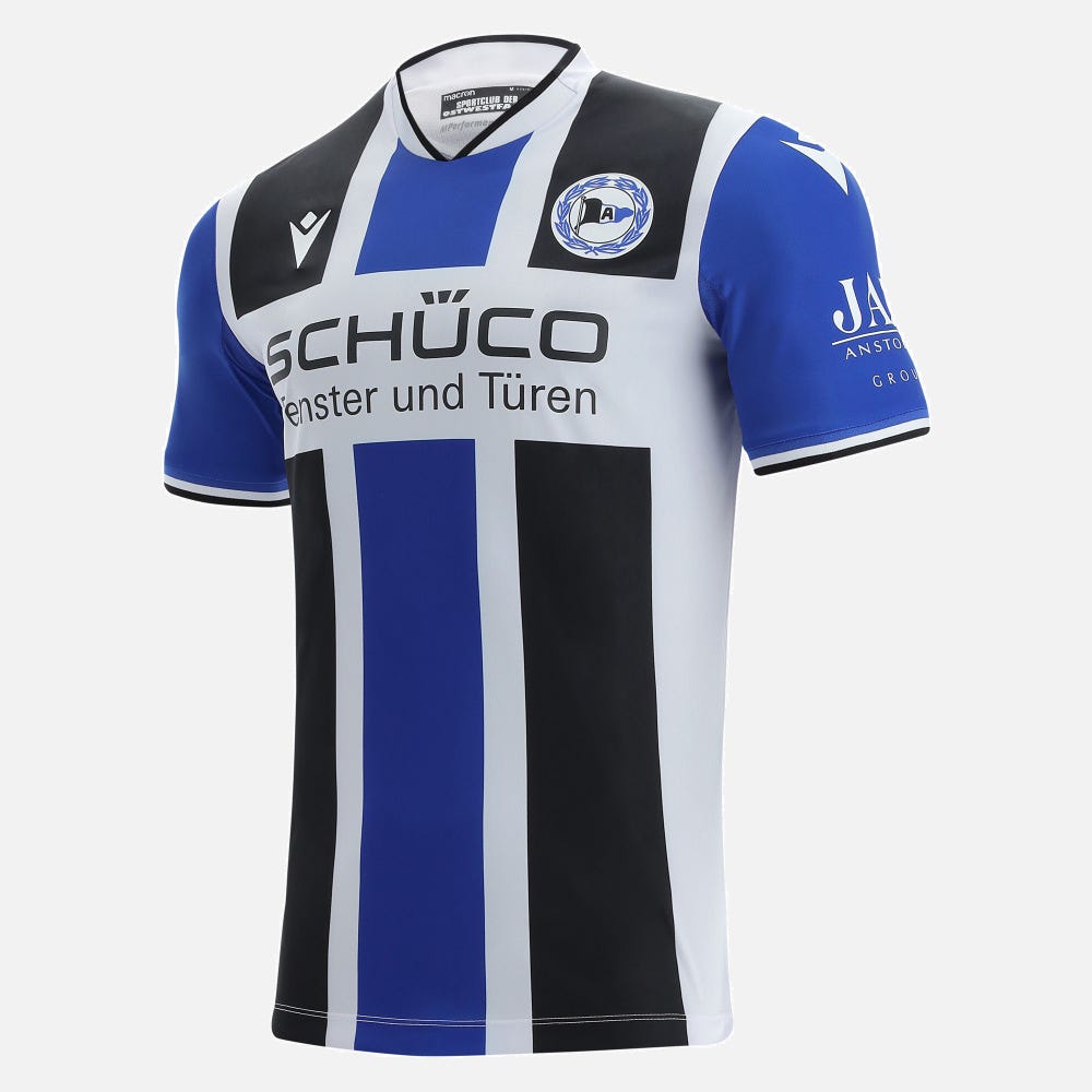
This bad boy is a little bit chaotic, but I think it works. The colours of the club crest being used but not feeling forced helps to make this shirt stand out. I think the thick colour bars broken up for the sponsor on the front gives the shirt a really strong feeling. It makes the kit stand out and shout at you to look at it. The blue sleeves really work as well at making the colours work even more.
9
AFC Ajax - Netherlands, Eredivisie

Everyone hop into the Wayback machine, we’re going to the good times. Back to the times when teams from countries outside the top 5 richest leagues could hope to keep their best players and maybe even win a major European trophy. This kit takes us back to those times. Back to when a team like Ajax, in 1995, with some of the best players in the world, could win the Champions League. This kit, with that big solid red stripe in the middle, evokes those nice memories and ideas of one of the soccer worlds most likeable clubs. The logo is a standout, half on the red and half on the white parts of the shirt. A shirt that is a reminder of the ideals of soccer.
8
Reading FC - England, EFL Championship
How do you beat a classic? This year is Reading’s 150th anniversary. All those years ago, their team played in blue and white hoops, white shorts, and socks with hoops. The blue and white hoops are really working for me. The gold around the collar and ends of the sleeves adds a beautiful little bit of colour. But what really makes this kit stand out for me over all the other blue and whites, is that beautiful gold and white club crest. It gives a pop of colour that immediately draws the eye. It is a clean, easy, nice look for Reading this season.
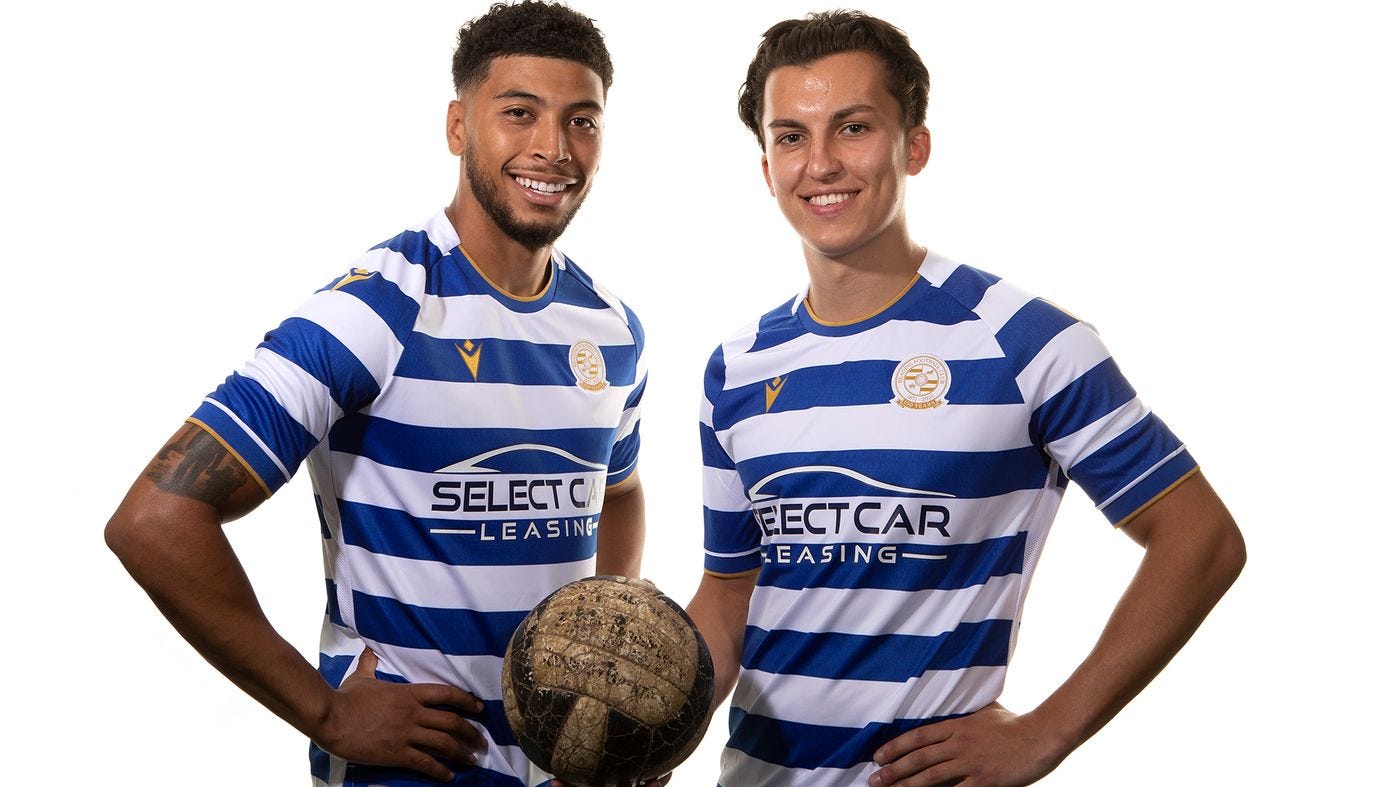
7
1. FC Union Berlin - Germany, Bundesliga
Kachow. This Union kit is beautiful with its solid colour choice of red with white trim. As we all know, if it’s painted red it goes faster, so Union will be hoping this new kit will help them build on their first season back in the Bundesliga last year. This kit is also made of 100% recycled polyester, which wins it some bonus points. My favourite part of this kit is the sponsor, however. I don’t even know what the company is, and I refuse to look it up for the inevitable terrible things they’ve done, but damn does it look cool on that shirt. The fact it is just simple white text so that it doesn’t clash with the colours already on the shirt makes it stand out even more. Simple and effective.
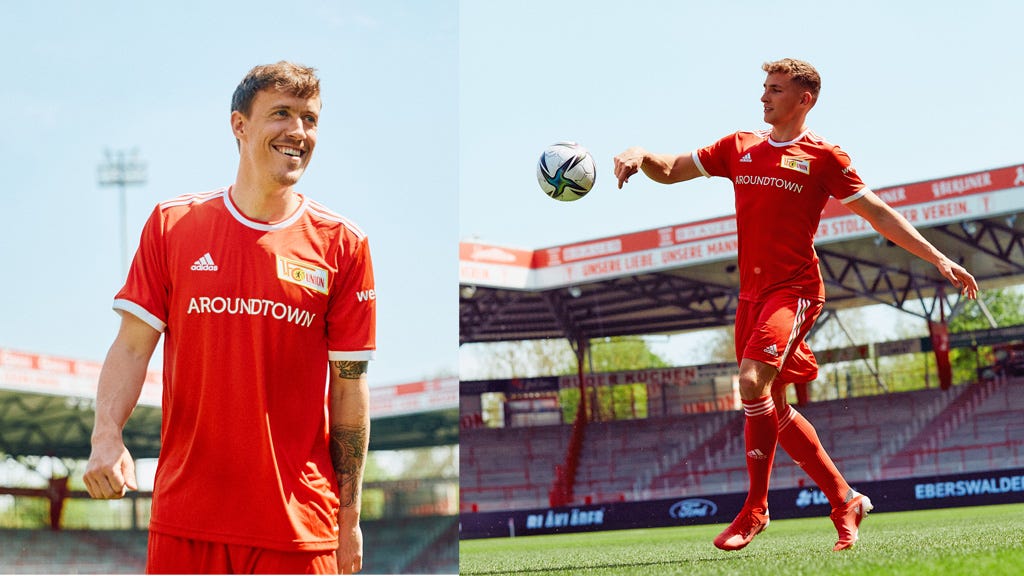
6
Swansea City AFC - England, EFL Championship
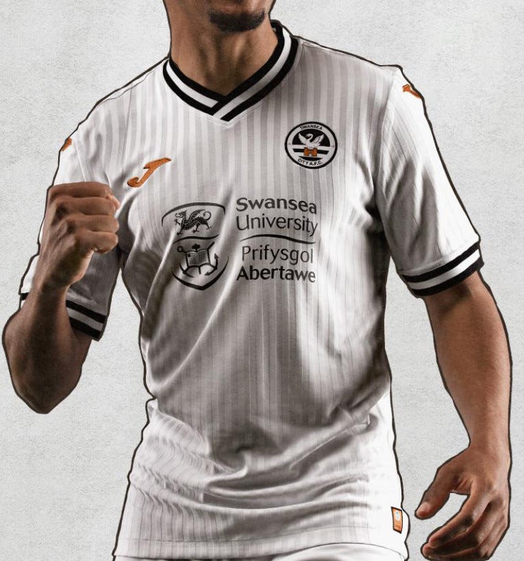
Oh baby, now THAT is a crest. Now Swansea’s normal crest is good and clean and modern. But this is a beauty. It gives the whole shirt a feeling as though you woke up a hundred years ago. The rest of the kit is just a classic white with the little off white stripes to give it some extra texture. The black and white trim matches the crest and makes it pop out even more. The gold of the Joma logo gives a little splash of colour to the kit as well, and the sponsor almost fades into the kit in a way that it stands out but doesn’t dominate. Smooth.
5
Bayer 04 Leverkusen - Germany, Bundesliga

I am starting to realize I have a bit of a thing for crests that stand out. That blacked-out crest with the white highlights is so good. It looks cool, on a shirt that is already slick. The thin red and black bars are uncomplicated, and that works for this shirt. The white highlights on the collar and sides give it just enough colour to make sure the kit doesn’t feel monotonous. Sleek and cool.
4
TSV 1860 Munich - Germany, 3. Liga
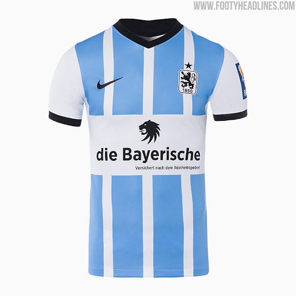
Kind of similar to the Bielefeld kit at number 10, but even better. Going for the two colours of just blue and white makes this kit look very simple, in the best way possible. The light blue is a lovely colour as well. What really helps this jersey to look even better is the sponsor. That lion matching the crest of the club really makes the kit have a sense of balance. Simple and nice.
3
Venezia FC - Italy, Serie A

I mean…. what can you even say about this one. One of the coolest kits around. That all black, but somehow has the look of dusty marble. The Kappa logos going down the arm. The gold stars in the centre that make the V for the club name. The beautiful orange and green club colours trim gives it just a pop of excitement with the sleek black. The team name taking a central role instead of a sponsor. That club crest in gold. This is a special, special jersey. Every part of this is working together. Just cool as all heck.
2
Club América - Mexico, Liga MX

I don’t think anyone does colourful kits better than Club América. That yellow and black alone would be beautiful, but Club América uses inspiration from Aztec patterns, as well as playing on the colours of sunrises in Mexico City. the colours of this kit really are the best on the planet. The black sleeves and the black stripe down the sides do well to break up the colours and give it the trim it needs. The only knock I have on the kit are the sponsors, but what can you do in this modern world.
1
Olympique de Marseille - France, Ligue 1

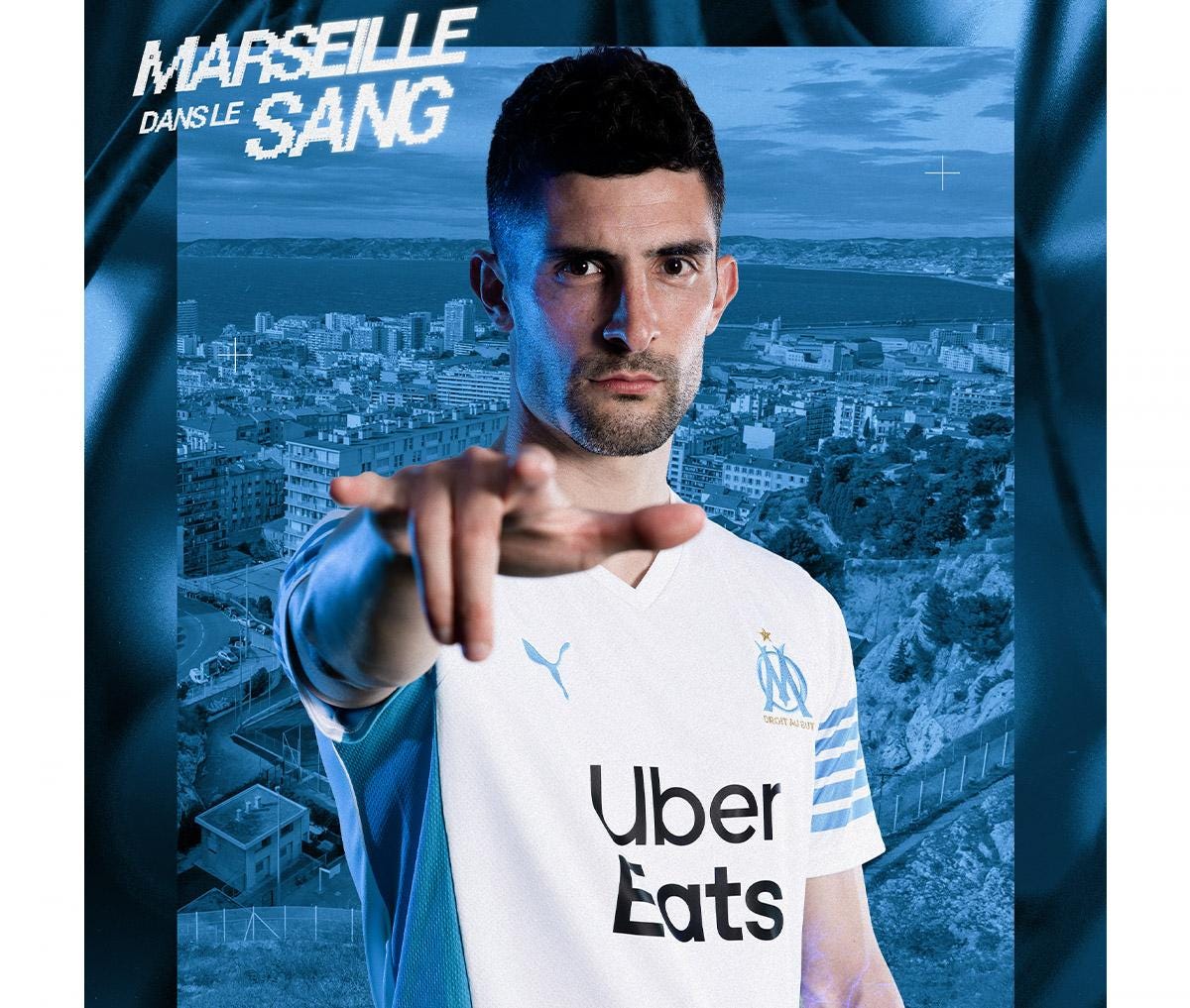
There could really be only one. Evoking memories of the only French team to ever win the Champions League in 1994 (however dubiously that may have been), this kit strikes all the right notes. The blue stripes on the arm and the inside of the sides give it the cool and classic feel of the 90s. That beautiful crest stands out on the all white. The best part of this kit is that it doesn’t try to do too much. It’s simple, easy to enjoy, and lovely on the eyes. A home run.
Honourable Mentions
FC Augsburg - Germany, Bundesliga
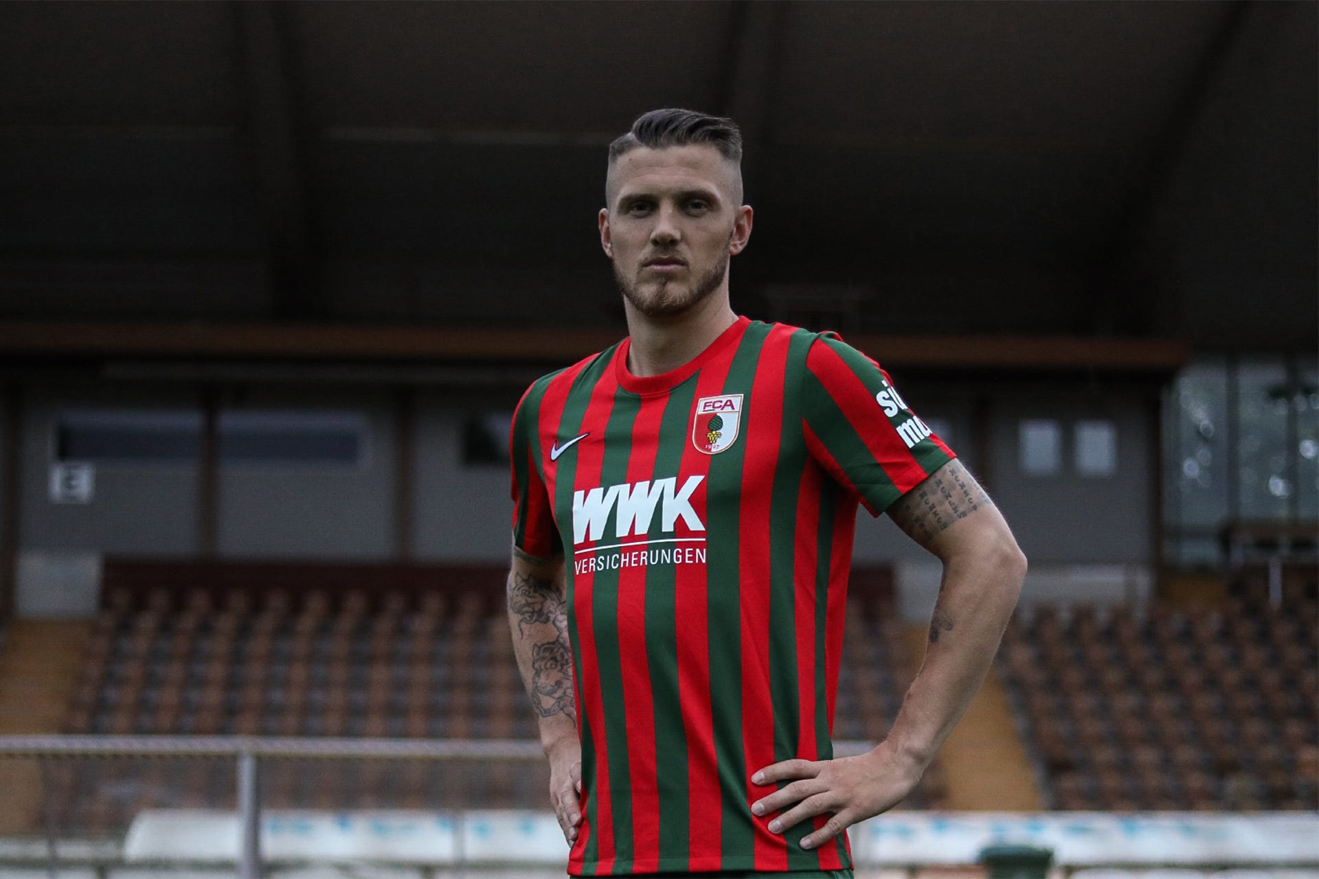
It looks like a class New Jersey Devils vibe. And also Christmas. Awesome.
Rayados de Monterrey
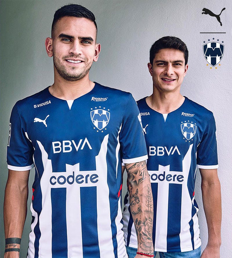
I like the blue and white.
Sheffield FC
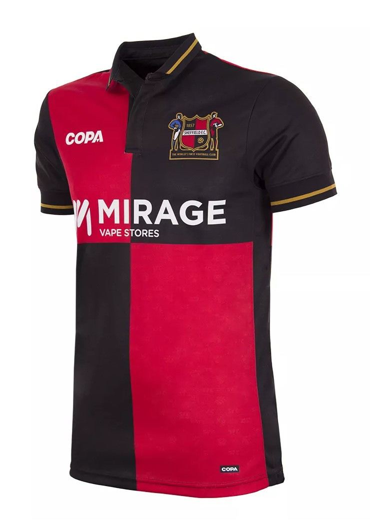
The black and red colour blocks are very cool for the oldest club in the world.
So that’s all for this post! A lot of words about things I just enjoy looking at! I hope if you made it this far you have some feelings about kits too, feel free to share ones you love or hate, or that I forgot! Next time I’ll look at my favourite away kits, bye for now!