

Jersey Joys, 2021/22 (Away)
A look at my favourite away kits in the world of soccer for 2021/22.

Okay, you know the drill. We’re gonna have a gander at some of the away kits from around the world that I think look the best. This will help you choose your FM save for the year. Without further adieu, let’s go!
10
Aberdeen F.C. - Scotland, Scottish Premiership

As you will see below, I think a blue and gold mix is very good. This blue and orange-golden trim works really well to make the kit not feel too boring. The really faint pattern in the kit works to bring a little life to what could just be a dark drab colour. A nice one!
9
Stade de Reims - France, Ligue 1
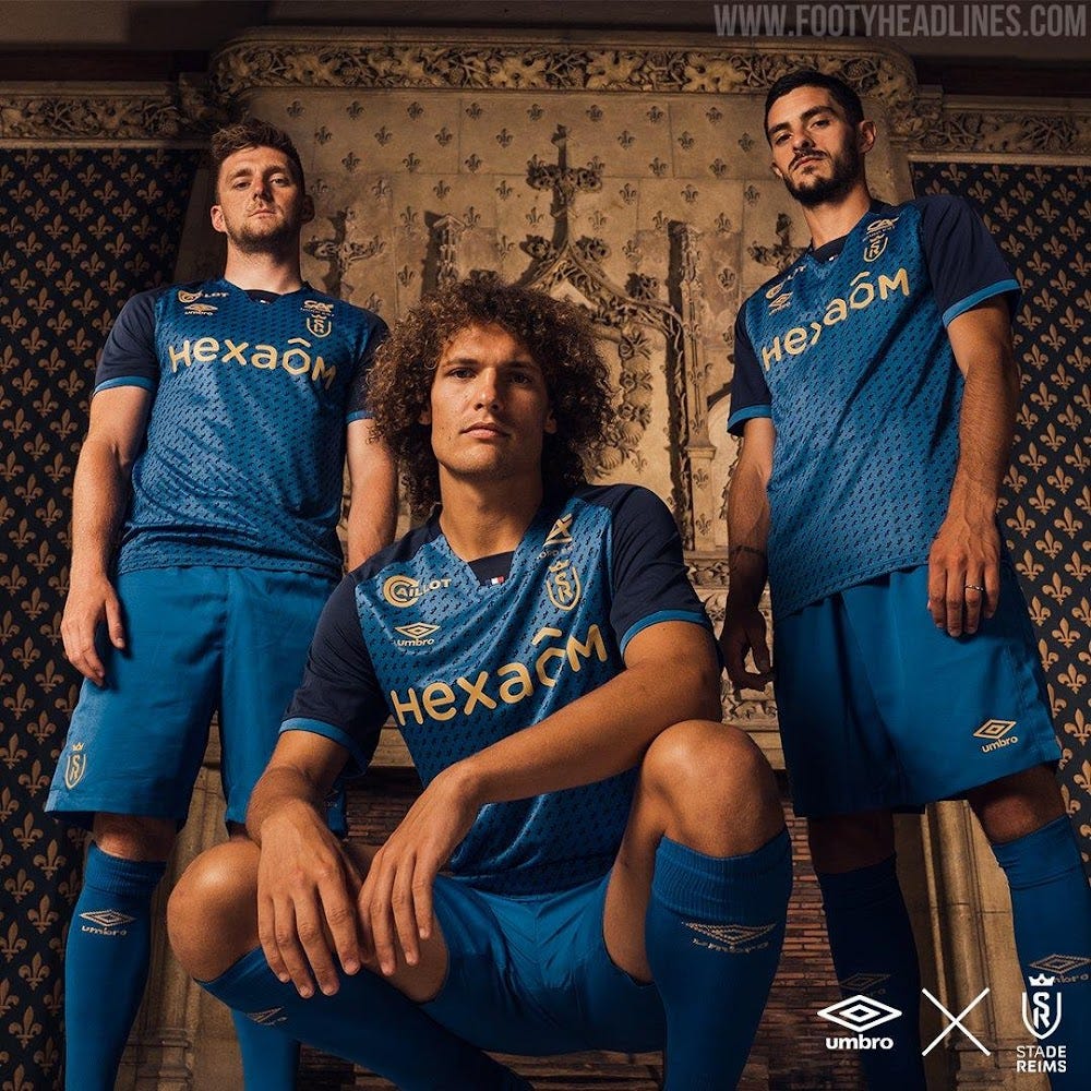
I mean how do you not love a bit of this? Blue and gold are such a good mix. The pattern on the kit is small crowns, based on the club badge. The use of a darker shade of blue on the shoulders stops the kit from feeling too monotonous. A really clean kit.
8
Sheffield F.C. - England, Northern Premier League Division One East
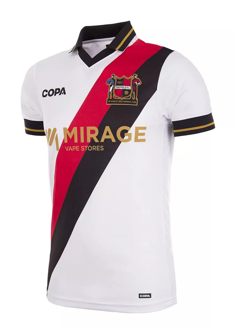
A sash you say? Not something I saw myself loving, but I think it really adds life to this kit. The black trim on the arms and the black collar are very good additions as well. I really enjoy that this kit isn’t trying to do too much. It’s a simplicity that really works.
7
Manchester City F.C. - England, Premier League
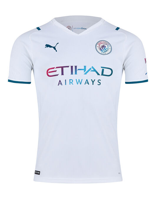
I don’t know what it is about this thing, but it just reminds me of 2011’s Drive. A good movie, and a sound that gets stuck in your head no matter if you like it or not. That’s how I feel about this kit. Nothing about it stands out as amazing alone, but when you look at it, it just clicks in your brain. The colour palette adds the flash it needs to that all-white kit. A real brain-worm of a kit.
6
Arsenal F.C. - England, Premier League
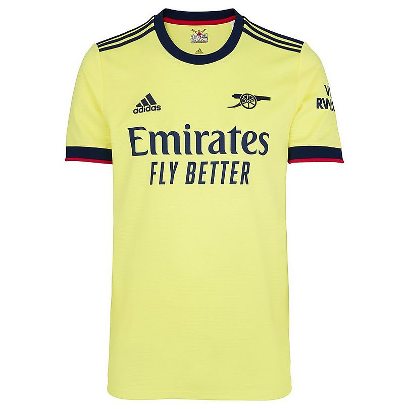
Yellow is typically not a colour I love, especially this yellow. But something about this stands out. The dark accents are really helping this kit feel more alive. The classic cannon logo is a great feature, as it doesn’t distract or make the kit more complicated than it needs to be.
5
Coventry City F.C. - England, EFL Championship
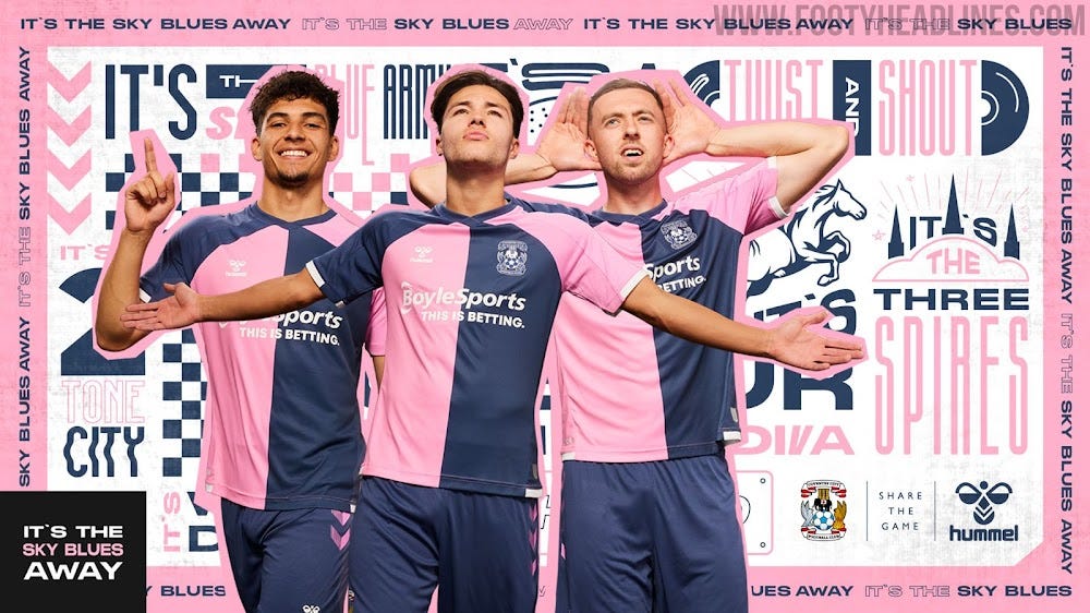
Oh yes. I love when a pink kit is done well. The light to dark opposition on this kit is great. The two central colour blocks with the reverse shoulders is so a little bit of fun without being distracting. At the neck point, it makes it look like the front of the kit is exploding into the pattern, which is great. A very nice addition to an underused colour in kits.
4
FC Schalke 04 - Germany, 2. Bundesliga
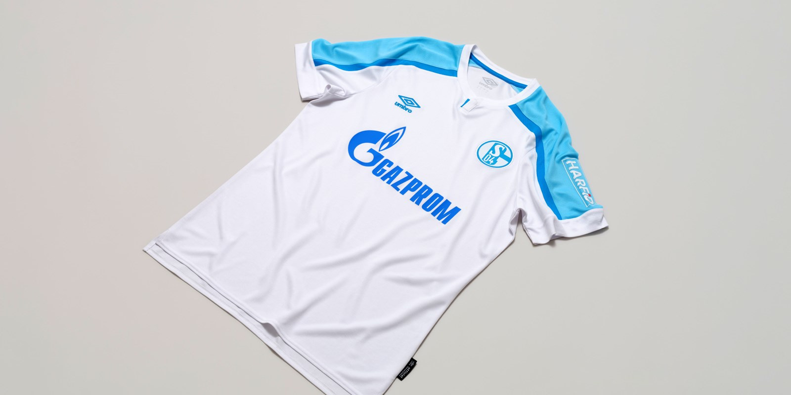
For me, this is a better version of the Man City kit. Just a little bit more colour on the shoulders really makes it pop. The two blues mean it feels even more alive. The club badge matching the lighter blue of the shoulders and the sponsor matching the dark blue gives the kit nice symmetry.
3
AFC Ajax - Netherlands, Eredivisie

I love what Ajax have done with all their kits this season. Each one is so different from the other that it not only makes each one feel like a standalone design, it also means the kits can each be put up as their own individual project to be judged. This away kit is something special. The three shades, the two blues being the main colours and the third a lighter accent all manage to pop, while not distracting from each other. The fact they managed to make all of this work together and be really pleasing to the eye makes this a top kit for sure.
2
Bradford City AFC - England, EFL League Two
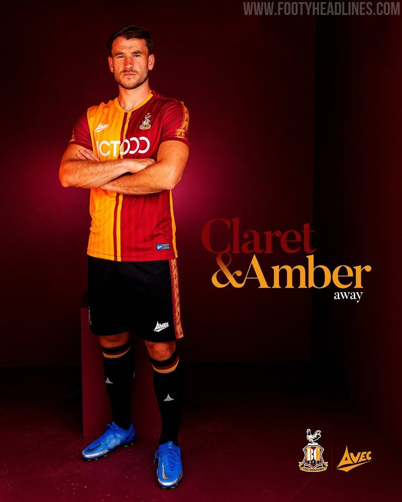
Making Mcdonald’s sexy since 2021! Jokes aside, this kit bangs. That two colour block pattern with the faded stripes looks so good. Those two opposing stripes down the middle break up the solid colours just enough to stop the kit from feeling like it was half done. The matching red arms on each side with the shoulder patterns just adds a cherry on top. What a beauty.
1
Aston Villa F.C. - England, Premier League
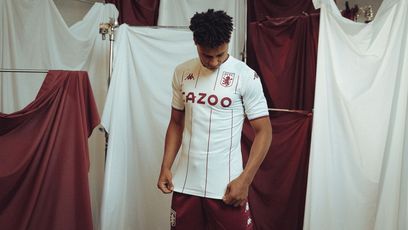
Sweet mama. I don’t even have the words for how much I love this kit. Inspired by the 1982 European Cup triumph, that colour pattern is special. The claret thin stripes on the white shirt, the logo colour fitting, and even the shorts all work together perfectly. This is one of the best looking kits I have ever seen. It manages to capture the feeling of a traditional kit, while not looking outdated. It has enough modern trappings with the Kappa logo on the arm and chest to make it fit in both a modern and traditional world. Truly a stunning kit.
Well, that’s all I have for today! I had a lot of fun writing this one, taking a look at some of these absolute beauties. What I’ve learned is that for an away kit, I love something a little more simple in design. Hope you had fun looking at some pretty kits like I did!